Cafy's
When the partners of Cafy’s™ approached us about creating their graphic identity, they were busy planning a restaurant with a warm, community atmosphere.
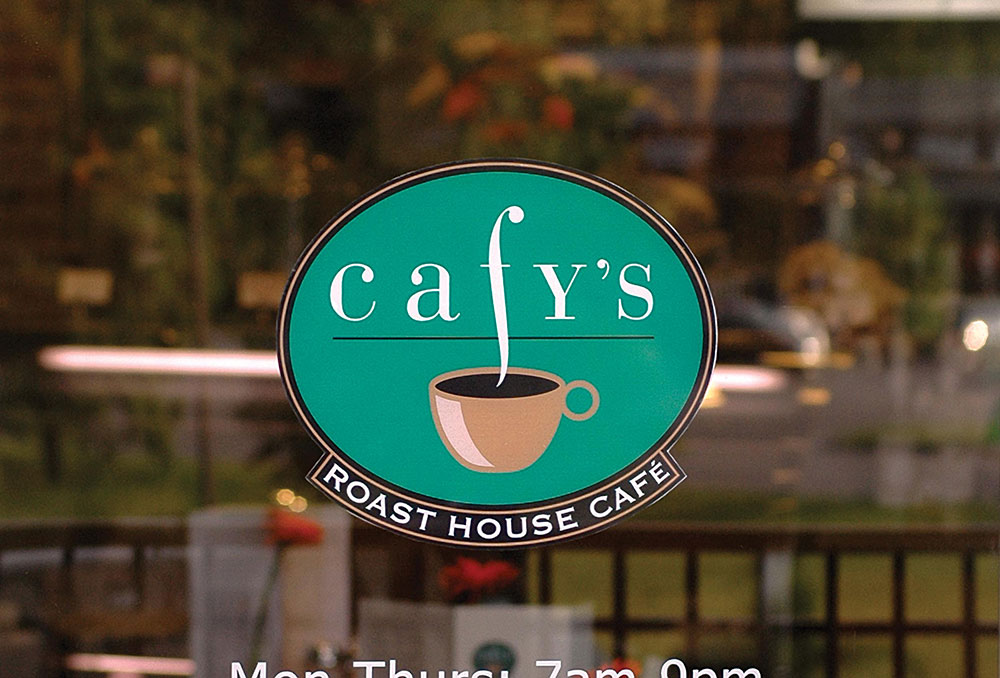
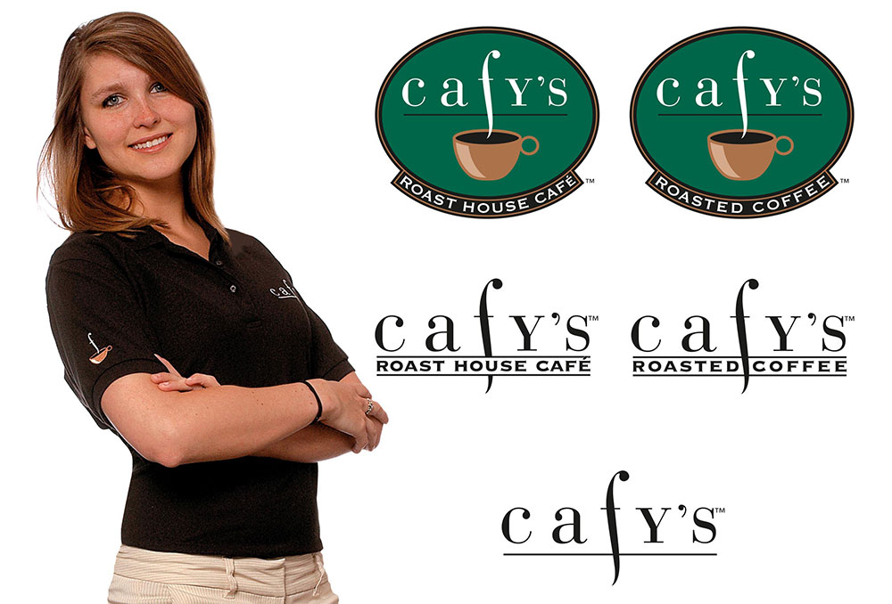
It was important to set an approachable visual tone while projecting an upscale feel to the mark. This was achieved with an unusual use of lower-case and capital letters split by a modified italic “f” rising out of a simple cup form to suggest steam set on a green oval. The cup and steam became a key element in the graphic system.
Type-only versions of the logo were developed as the need arose over the course of the identity program development.
Deliverables
Design & Production
- Logo series
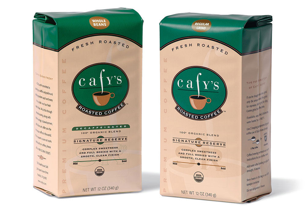
- Packaging and label system
- Business papers—letterhead, envelope, and business cards
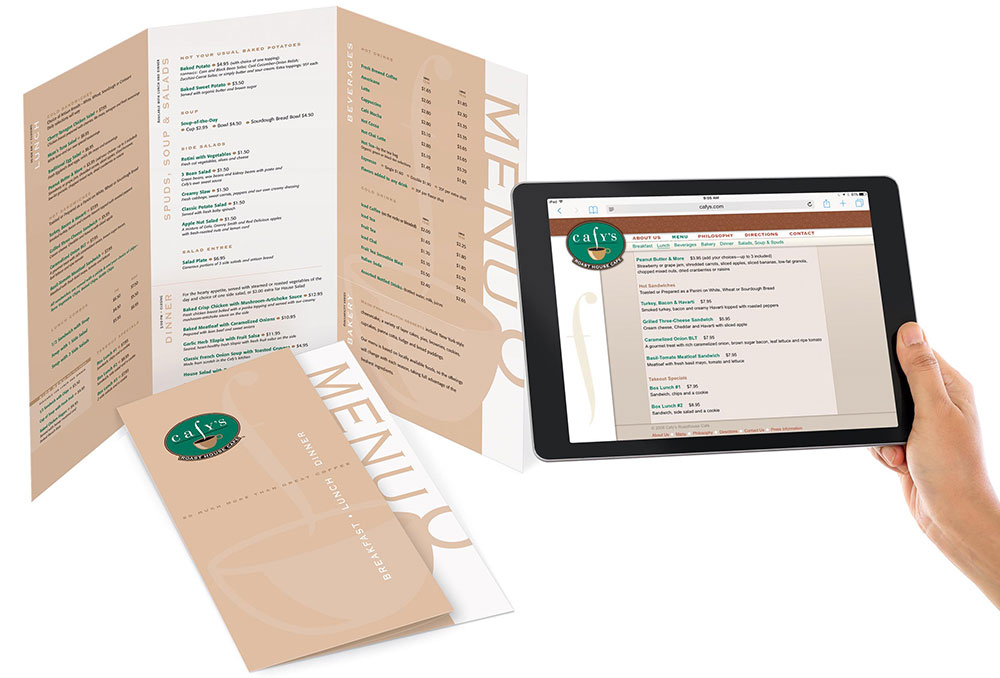
- Website
- Advertising
- Menu
- Exterior signage
- Cash card
- Invitations for opening event
Consulting
- Uniform design
- In-store signage
- Pricing
- Marketing
Awards
- Gold; Graphis Logo 8
- Gold: Graphis Branding 5